The Dengler Domain: Logos
As time chugs on, the human population interest in trends and fads differs dramatically. This puts increased pressure on businesses across the nation to keep up with trends and fads by changing their corporate logo. In today’s world, businesses go with the simple sleek, crisp design of the logo. Facebook, Amazon, and Google represent this design. There are logos which should have never changed. Unfortunately, they were changed because the company went a new route, was bought, or went out of business. Here are some which should still exist in today’s world.
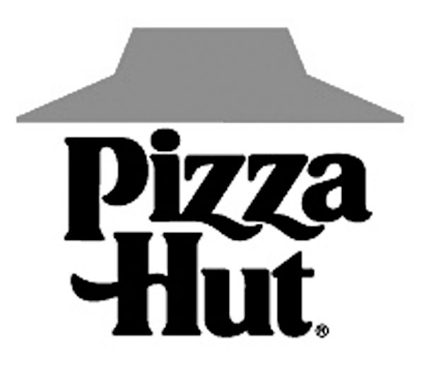
This Pizza Hut logo is gorgeous. The simplistic feel is the best part. The simple lettering does wonders to catch the eye. No need to be fancy when competing in the pizza business. This logo is not crazy, and luckily, it did not get caught up in the 1970s logo craze. Pizza Hut used this logo from 1967 to 1999. The red hat is beautiful. It represents the red roof on Pizza Hut buildings. The red and black colors intrigue anyone who looks at this delightful logo.
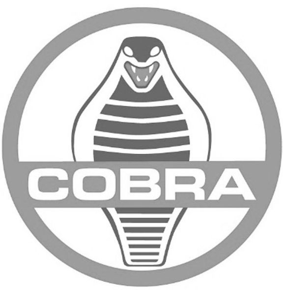
This is a glorious logo for the Shelby Cobra. Before doing research for this article, I had never seen this logo. The logo represents a lot of different parts of the car. The red circle with the line across it is a steering wheel. The actual cobra snake signifies the stick shift of this fast car. The cobra is a crisp design that would stand out in today’s world. With the way it sits inside the red steering wheel, it is beautiful. The logo screams this Shelby Cobra is a quick, fun, and dangerous to drive car. The colors are perfect complements in this logo. The designers of this logo did a superb job.
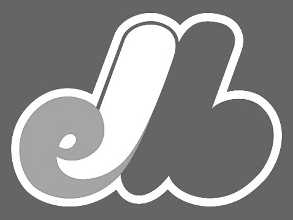
The Montreal Expos are long gone, but their logo continues to be beautiful. The use of red, white, and blue in their colors catches anyone’s eye. The fluffiness of the logo is in stark contrast to today’s sharp looking logos. The coolest part is watching the e and the b, representing Expos Baseball, come together to form an M, for Montreal. That is nifty, and they earn major bonus points for this great innovation. This logo definitely feels it was made in the late 60s, early 70s. This does not matter. This logo is still rockin’ in today’s world.
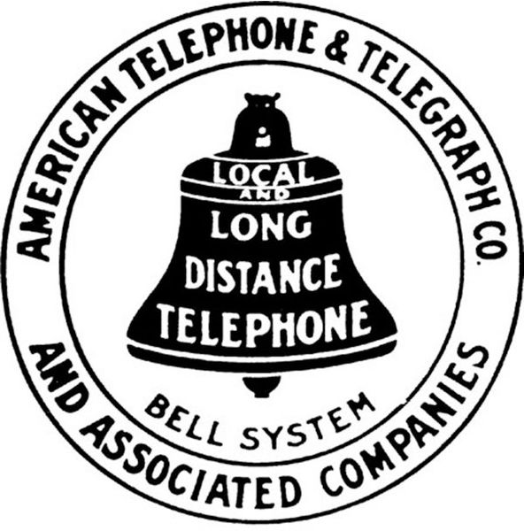
Finally, American Telephone & Telegraph, for short AT&T, logo is the last one. I knew of the blue and white sphere, but I had never seen this logo before doing the research. The amount of words used in this logo is astonishing. AT&T piled on word after word with this logo. This negates the use of using hidden meanings or subtext. The logo shows everything it does as a business. The AT&T logo represents the years of the company with its simplicity and no color usage. I love the vintage feel, and I would buy a shirt with this logo.
All these logos show a different part of American history. If I chose a favorite from these four, it is easy. Drumroll, please. It’s the Cobra Shelby logo. If this were a basketball game, this logo won by fifty points. I like the other logos, but that Cobra is magnificent. I want a Shelby Cobra just for the logo. It is beautiful. As with this logo and all others, let’s cherish all of them. Unfortunately, in the future, all lame advertising executives will want to change any company’s logo for better or worse.
Email Sean with your thoughts and ideas for future columns at: “mailto:sean.h.dengler@gmail.com”>sean.h.dengler@gmail.com
Editorials

Feenstra learns lesson about showing up

Q&A: Foster Care Month

Win Big at Freedom 250: SBA Competition Offers $1 Million in Growth Funding
Why Trump’s call to pull 5,000 US troops from Germany will hurt America
Q&A: Fertilizer Costs Jolt Farm Economy